In this post, I'm going to explore gradient mapping in Photoshop.
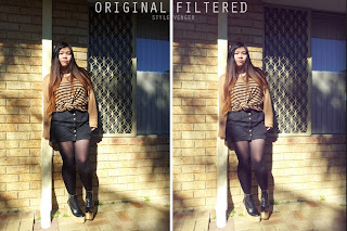
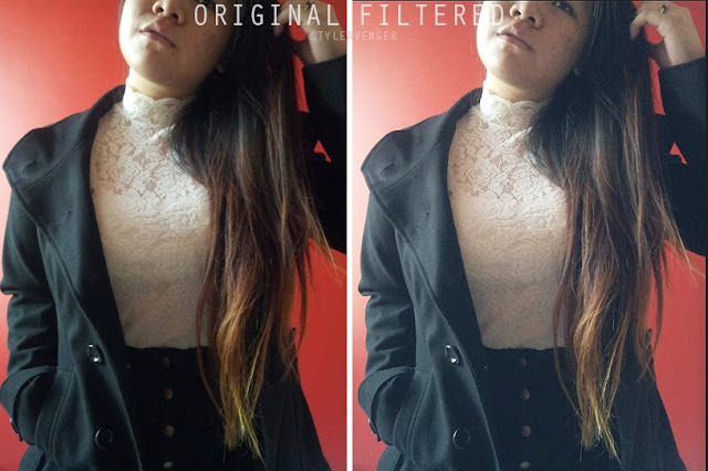
 Alot of people ask me how I get 'instagram' filters on my photos and I've been doing it for years long before instagram became a thing. The reason I call them 'instagram' filters is because they have become very popular recently though apps such as instagram, photowonder etc. and these types of photos appearing a lot on sites such as tumblr and pintrest.
 What they actually are, I would say, is gradient mapped filters that can be used to achieve certain atmospheric effects. They can be done very on any photo editing programs. I am using CS6 but I have done similar on programs such as Paintshop Pro 9 etc.
STEP THREE: Gradient Map
Alot of people ask me how I get 'instagram' filters on my photos and I've been doing it for years long before instagram became a thing. The reason I call them 'instagram' filters is because they have become very popular recently though apps such as instagram, photowonder etc. and these types of photos appearing a lot on sites such as tumblr and pintrest.
What they actually are, I would say, is gradient mapped filters that can be used to achieve certain atmospheric effects. They can be done very on any photo editing programs. I am using CS6 but I have done similar on programs such as Paintshop Pro 9 etc.
Anyway, if you are interested in finding out how I colour manipulate my pictures, jump the cut (aka click read more) to find out below! This is a tutorial on gradient mapping. Warning: Image heavy!
*****note: this 'tutorial' requires some very basic photoshop knowledge, such as copy/paste, cropping, sizing etc. If you don't know how to do those very basics, it might be pretty confusing. More importantly, understanding colour will be crucial to getting a good outcome with this method. But I've explained ALOT so no other skills required, don't worry
*****disclaimer: I am self taught and do not know the 'proper' way, if there is one, to do this. I'm sure there are other ways to achieve similar effects but I prefer this one personally. There are no right or wrongs! Only good or bad outcomes!
Before we get started: open your image and perform your desired adjustments in regards to cropping, sizing yaddah yaddah. Most images work with this process of colour altering but pictures with the presence of strong whites and darker shades will result in a clearer outcome. This sometimes can be enhanced by fixing the contrast.
This is a very long explanation just to cover every base possible. I will put extended/additional notes in a smaller font size for those people who need them, but if you get the step right away, feel free to skip the smaller parts.
STEP ONE: duplicate layer
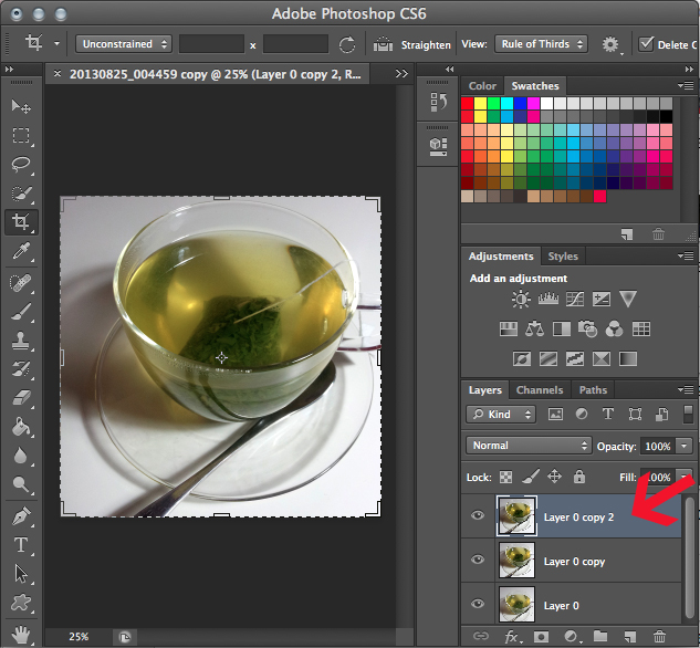
STEP ONE: duplicate layer
The bottom right corner will show you the different layers your image is on. Duplicating a layer is basically putting another copy of your image on top of the original and it helps when you are making several edits and changes to the image.
Click the small lifted page icon next to the trash can on the right corner to duplicate the layer. (You can see I've done it twice so far.)
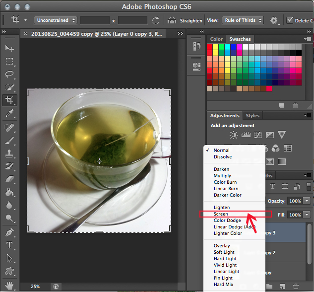
STEP TWO: set to screen
You see the little drop box in the previous picture that says 'normal'? (above your layers and 'lock'.) Click on it and a list of overlay filters should appear (pictured below). They 'filter' your image and create certain effects that show certain parts of the image underneath.
Set it to 'screen' (above). Here's where having a darkish/contrasted image helps.
The 'screen' filter enhances the whites/light in the image so if your photo is already bright, the result will be a super blinding image that looks overexposed.
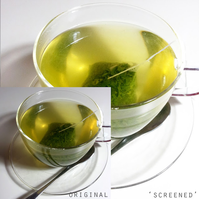
Disregard how weird the image looks at this screen stage! The reason we do this is to have the layer underneath show through in the next few stages
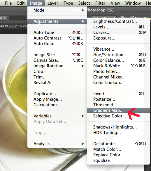
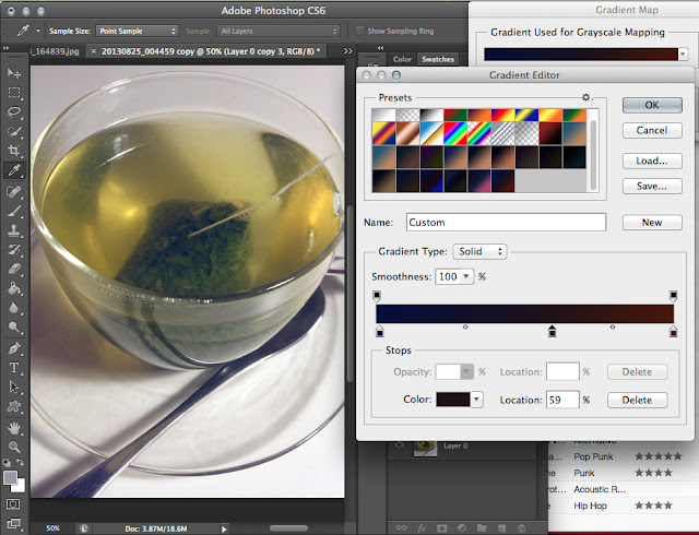
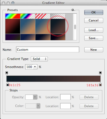
STEP THREE: Gradient Map
This is the step in which we actually 'filter' the image with different colour schemes and the most important step. Head over to image> adjustments> gradient map
First, we need to know how to adjust the different settings on gradient map. The window in the top right of the screenshot below (with the grayscale gradient bar) is what will pop up first.
Click onto that bar as I've indicated and the window underneath it (gradient editor) will pop up with more gradients. If you have not used this before you will only have a few heinously bright gradients. The other ones I have (that you won't) are saved ones I've added, and what you will be learning to do today!


Your display should look something like above. The popup windows are moveable. Note that my gradient map is on the default greyscale gradient and as a result, the image is looking very weird and pale right now. The default gradients will not work effectively with all images because all images have different properties, therefore will look different if the same gradient is placed on them.
We are going to look at the gradient editor. The reason why you need to make your own gradients is because if you can edit how the colours appear, you can adjust the filter to any photo you chose to use it on. It can be very difficult and confusing at first, but once you know the controls, you can create a limitless number of different filter styles.
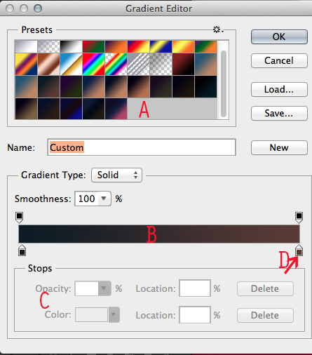
I have tried to label the most import parts that must be understood in order to create your own filters.
A: gradient preview area
B: gradient bar
C: stops section
D: stop/tab
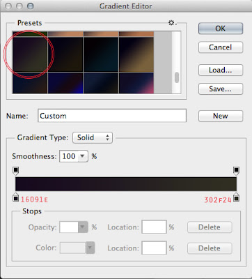
Now your gradient editor should be selected on the default first gradient. It should be on the grey one but if not, click once and select the grey gradient. Now section B should show up with a gradient that goes from grey to white.
A is the area where all your gradients can be previewed. If you click onto any one of them, the gradient will appear in bar B. The tabs on the top and bottom of the bar are known as Stops. They can be dragged along gradient bar B and determine the blending style between your chosen colours. Area C 'stops' is where the colour settings will appear and where you can change them.
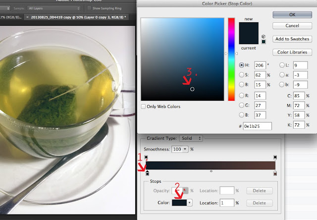
STEP FIVE: Stop colour selection
***Stops are the little tabs on either side of the gradient bar. They hold little tabs of colour that are show the colours you have placed on your gradient.
Click on the stop leftmost under the gradient bar(lbled.1.). The tiny box of colour you clicked on will now show in the stops section(labelled as 'C' in the previous image) as the 'color'. If you click in that box of colour (2.), the Colour Picker window will pop up.
A is the area where all your gradients can be previewed. If you click onto any one of them, the gradient will appear in bar B. The tabs on the top and bottom of the bar are known as Stops. They can be dragged along gradient bar B and determine the blending style between your chosen colours. Area C 'stops' is where the colour settings will appear and where you can change them.
STEP FIVE: Stop colour selection
***Stops are the little tabs on either side of the gradient bar. They hold little tabs of colour that are show the colours you have placed on your gradient.
Click on the stop leftmost under the gradient bar(lbled.1.). The tiny box of colour you clicked on will now show in the stops section(labelled as 'C' in the previous image) as the 'color'. If you click in that box of colour (2.), the Colour Picker window will pop up.
Your selector will be on the colour that is in the stop you clicked on (mine is at 3. this is the colour of a gradient map that was last used).
Right now I have the image visible in the background because it gives me a live preview of the changes I'm making. This is extremely useful.
 S
S
S
so here is the basic key to the stop tabs:
Left side- dark tones
Right- light tones
(You can add more stops along the gradient bar to affect the gradient blend but this is a bit advanced for now.)
Here's where it will get a bit confusing. The stops on the left side of the gradient bar control the blacks/dark tones of the image and the stops on the right side control the whites/lights. You can see how I've clicked onto (1.). You generally want to stick to having a dark shade on the left tab and a lighter one on the right. This creates the subtle filter effect. If you did the opposite, the image would look inverted/no contrast, with the dark areas appearing light and the light areas appearing dark.
Now onto colour intensity. What I am referring to here is how much of the colour in your gradient will show in your filtered image. So if you think about instagram and the filters, when you're choosing what filter to put on an image, you usual choose one that looks relatively natural, right? Some filters are just too strong, where the original colours of the photo disappear into bright random tones that make the photo look tacky. Well choosing the right colour intensity at this stage will help control this in your image!
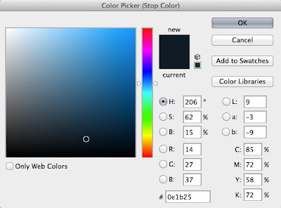
Right now I have selected where the circle is- on the colour #0e1b25. The shade of colour can be changed by dragging your mouse along the vertical rainbow bar and the value/tone of that particular colour is selected within the box. You need to know how to control this, therefore you need some knowledge of colour or at least some common sense or you'll be stuck. Don't worry about the colour codes on the right as you will probably never need them if you are a casual photoshopper.
Left side- dark tones
Right- light tones
(You can add more stops along the gradient bar to affect the gradient blend but this is a bit advanced for now.)
Here's where it will get a bit confusing. The stops on the left side of the gradient bar control the blacks/dark tones of the image and the stops on the right side control the whites/lights. You can see how I've clicked onto (1.). You generally want to stick to having a dark shade on the left tab and a lighter one on the right. This creates the subtle filter effect. If you did the opposite, the image would look inverted/no contrast, with the dark areas appearing light and the light areas appearing dark.
Now onto colour intensity. What I am referring to here is how much of the colour in your gradient will show in your filtered image. So if you think about instagram and the filters, when you're choosing what filter to put on an image, you usual choose one that looks relatively natural, right? Some filters are just too strong, where the original colours of the photo disappear into bright random tones that make the photo look tacky. Well choosing the right colour intensity at this stage will help control this in your image!
Right now I have selected where the circle is- on the colour #0e1b25. The shade of colour can be changed by dragging your mouse along the vertical rainbow bar and the value/tone of that particular colour is selected within the box. You need to know how to control this, therefore you need some knowledge of colour or at least some common sense or you'll be stuck. Don't worry about the colour codes on the right as you will probably never need them if you are a casual photoshopper.
So the top left hand corner will always be white (#ffffff) and the bottom left will always be pure black (#000000). The difference from top to bottom is value(light to dark) and the difference left to right is saturation(dull to bright).
So remember:
left--> right = colour saturation
top--> bottom = tone
This influences the filters too (which is why I'm explaining this with detail).
Just so this makes more sense to you, here are some examples.
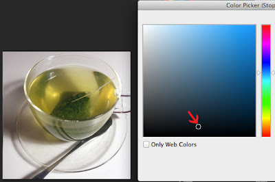
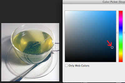
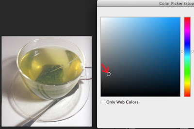
The closer to black the shade you select is, the less apparent the effect will be as a filter. (above), I have chosen a colour close to the bottom- near black- and as you can see, there is basically no difference from the original.
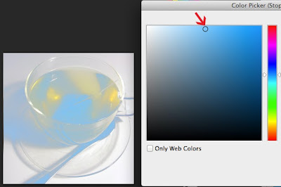
Now here I've dragged my colour picker straight up top, and the blue is very visible. top to bottom influences the intensity in value that will appear in your image. So choosing a light colour will make the dark tones look lighter by appearing more through the filter, and choosing a dark colour will keep them close to the original.
If you can imagine putting a dark colour ontop of a dark colour, not much of it will be visibly different.
**Because the stop I chose was the one on the left, this is influencing the dark shades (as I mentioned before- it's important!). If I were to choose the stop tab on the right, it would be exactly the same but editing the light shades. With the light shades, it is not opposite. It is the same, so the darker the colour you choose, the less visible it becomes.**
Now if you look very closely at the next two images, the selector is roughly in the same position from top to bottom, yet the outcome on the image is entirely different. The position of the picker left to right influences the saturation of colour in your filter.
My selection above is a blue-black. This will make the dark shades if your image tinted with a blue hue. Below, I have chosen a colour with the SAME value but different intensity. It is a grey-black and therefore the dark tones in the photo look greyish.
This is pretty straightforward once you play around with it a bit. So if my over explaining of directions is confusing, just go around and click in various areas of the colour map and observe how they change the filter.
Once you've understood how to manipulate the colours according to the value/intensity of your image, you can make any sort of gradient you like.
Complete this step with two colours. The left stop and the right stop. Like a said before, the easiest would be a dark (left stop) and light shade (right stop). This is where knowledge of colour is important. There are millions of colours and you need to know what compliments your photo or what shades would suit each other.
Once you have done so, click 'new' to load it into your gradient preview area. This saves your colours. You can use it for other images of similar value this way
STEP SIX: finishing your gradient!
The one I have chosen for this teacup image is this:
The one I have chosen for this teacup image is this:
I want to enhance the blues but also keep some warm tones in the image. My gradient is very dark, as I prefer very subtle filters as compared to garish and bright edits. Once I am done, I click 'OK' and the filter is applied! :)
Usually I go for the 'vintage' or 'lomography' effect, which is using a very dark blue/purple in the dark tones and a creamy or washed out tone occupying the whites.
You can see quite a few of my gradients are this similar combo in my screenshots. Depending on the photo, even the slightest difference in value/saturation makes a huge difference, hence why I have so many similar ones
You can see quite a few of my gradients are this similar combo in my screenshots. Depending on the photo, even the slightest difference in value/saturation makes a huge difference, hence why I have so many similar ones
ADDITIONAL TIPS ON DIFFERENT FILTERS:
This is kind of confusing but very helpful once you understand how to use it. It is complicated if you don't really understand colours, or if you are unfamiliar with different filters and how they look over photos. Most photos don't look good under the same gradient map which is why you will need to adjust and make new gradient maps. If you are stuck for colour combinations here are a few that I use often and work well with different photos:

This is kind of confusing but very helpful once you understand how to use it. It is complicated if you don't really understand colours, or if you are unfamiliar with different filters and how they look over photos. Most photos don't look good under the same gradient map which is why you will need to adjust and make new gradient maps. If you are stuck for colour combinations here are a few that I use often and work well with different photos:
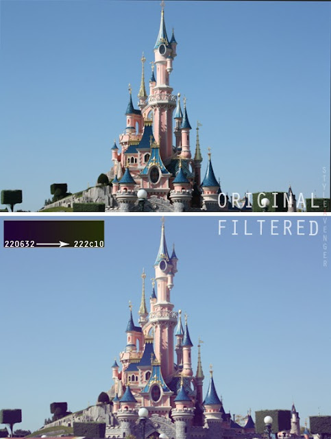
Below is the exact gradient I used. The codes in red are the colours.
This filter is a nice overall 'lomography' look similar to amaro on instagram. Generally works on most pics.
Another gradient I use a lot is the one below.
This gradient mutes the contrast on an image to give it a very worn, vintage effect. The reason why it looks better than simply minimising the contrast is because it still highlights certain areas and colours retain their relative vibrance.
You can see how these effects are now achieved and how they can make even cheap camera phone snaps like the ones I've used look a bit more sophisticated. Now I'll show you an example using a DLSR quality image (taken with the Canon 400D).
These filters work on HD images too, but they're very sensitive to slight changes due to the high resolution. Below I've pasted together other filters to show you that there is a difference of colour. Its barely noticeable to the odd viewer but if you delve into photo editing, these things become very visible!

The top two filters are more subtle and focus on the light areas. Left: enhancing the highlights with a warm peachy cream tone. Right: emphasises the warmness of the pink castle with a red colour on the left stop.
The bottom two are getting into more complex gradients with more than 2 colours but involve the exact same process as I have mentioned here. L: is playing up the rich blue hues whereas R: is blending the blues with pinker tinges.Alternatively, if you set the 'screen' onto 'normal' it will show you what the full gradient map looks like without the filter effect.
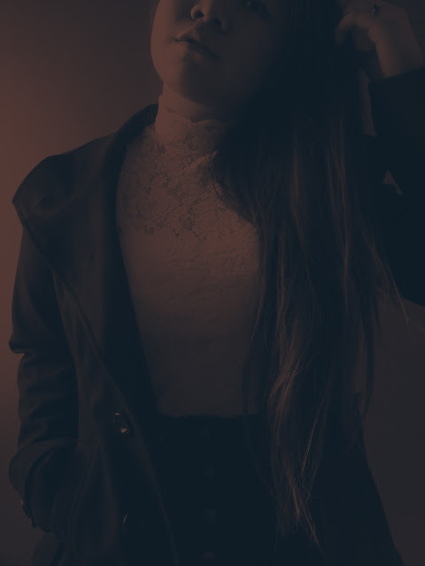
If you're looking for some artsy or semi abstract, they produce really awesome effects too. Looks something like this, but very different depending on your colour selection:
The bottom two are getting into more complex gradients with more than 2 colours but involve the exact same process as I have mentioned here. L: is playing up the rich blue hues whereas R: is blending the blues with pinker tinges.Alternatively, if you set the 'screen' onto 'normal' it will show you what the full gradient map looks like without the filter effect.
If you're looking for some artsy or semi abstract, they produce really awesome effects too. Looks something like this, but very different depending on your colour selection:

Once you are comfortable with the basic gradient map, you will be able to make more sophisticated filters!
So there it is! How instagram filters can be manually done. If you have any questions about the steps, don't hesitate to comment below or get into contact with me. This might feel totally complicated at first, but the more you do it, the easier it becomes to control the colour and determine what looks best!
I am looking into trying to duplicate the instagram filters and finding the gradient maps that work for it when I have the spare time. Good luck filtering :)
I am looking into trying to duplicate the instagram filters and finding the gradient maps that work for it when I have the spare time. Good luck filtering :)


0 comments:
Post a Comment